
Finding online course copy mistakes is like finding hidden treasure, because uncovering them helps so many people! Read on to learn about our favorite copy mistakes to find in online courses (they make us feel superhuman).
I have a confession to make: finding mistakes in course copy is as exciting to me as unexpected money.
If not more.
To me, it’s like finding a hidden gem that no one sees but you. And it’s a true gem because fixing copy errors helps people learn, which creates impact.
It’s like stumbling upon some hidden treasure that helps tons of people.
As a proofreading service for course creators, our job is to make online courses look professional — from their copy to their look and feel.
That’s why we’re sharing our favorite sneaky copy mistakes that we love finding in online courses.
Because course copy mistakes can zap your credibility quickly, and you need a discerning eye to catch the smaller, sneakier errors that slink by you.

#1 Non-Fully Formed Links
When you link to a resource in your online course, or to anything really, the entire word or phrase should be linked.
This isn’t set in stone, but ideally, you should link the entire word or phrase the student needs to click on.
But sometimes when you’re highlighting that word or phrase, your finger doesn’t quite highlight the entire thing and only part of the word or phrase gets linked. Check out the example below:
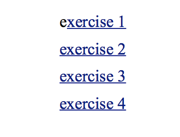
The “e” in the first “exercise” isn't part of the link. To me, this was an easy spot. Ever since I started copyediting professionally, I can’t look at words or phrases without automatically searching for errors.
And while most people gloss over stuff like this, some people catch it, and it can make your course look a bit sloppy. It almost looks like someone is sitting with one shoe on and one shoe off.
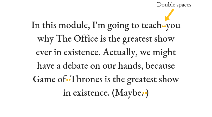
#2 Accidental Double Spaces
In high school and college, you were told to double space after a period. But we don’t have to do this in blog posts or even course copy if we don’t like that style of writing.
In most course copy we edit, we don’t see people purposely adding double spaces (unless they’ve requested we edit using AMA style). Double spaces are almost always an accident.
But the fun thing about finding accidental double spaces is that you have to have an eye for it. Nobody really sees this stuff because they’re reading too fast.
But copyeditors can spot it. Typically, I find it in slides and checklists. Check out the fun example below, where two orange dots indicate two unnecessary spaces.
 But if you weren’t born with the knack of easily spotting double spaces (it’s more of a hindrance than a superpower, I would say), then use CTRL + F in your course to find all double spaces and make sure they’re there on purpose if they are.
#3 Accidental Double Words
Double words take a close eye to catch — another reason it feels like you’re uncovering a gem when you find them.
They’re either set side-by-side or straddling a word or two, like in the examples below.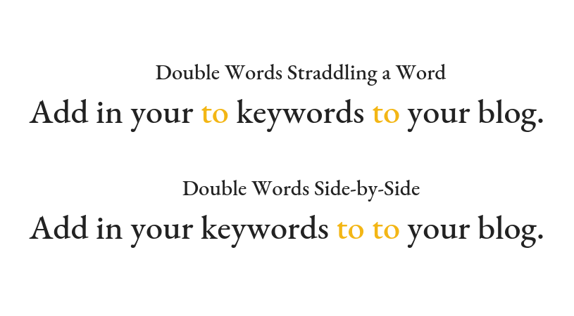
The trick to finding double words in your course is reading your course copy slowly. And I’m talking molasses slow. Because you can miss them even when you’re reading normally.
Removing double words, to me, is like cleaning a dirty bathroom mirror: when they’re gone, your student sees clearer.
#4 Inconsistent Capitalization

I love catching inconsistent capitalization in lesson copy and titles because no one else does. I’ve actually never not seen some form of inconsistency in a course.
The text just looks off when it happens. And your students will notice it the more time they spend in your course.
Consistency is the number one rule to keep in mind in copyediting and proofreading. I’d say anyone could become a proofreader as long as they were able to notice subtle differences in text.
Here is a great example of inconsistent capitalization in your lesson copy (recreated from actual course copy I have seen): In the example above, the capitalization is not consistent. Does the course creator want all of the letters that start each bullet point capitalized? Or none of them?
Whatever the answer, it should be consistent throughout the lesson.
I approach every lesson I edit with the challenge that something in the text is inconsistent. Are all lesson titles structured with the same capitalization? What looks different in this lesson versus the one before it?
Kind of like those picture games you’d see as a kid in Highlights magazine, where they’d display four images and ask: which one of these is not like the others?

#5 Missing Words in Sentences
This is another one I love catching — missing words in sentences.
Usually, missing words are small words we forget when writing sentences, like “in”, “to”, or “of”.
Check out the sentence below. Can you find the missing word?
It’s crazy to think how fast our brain wants to get the words out, and how slow our fingers are to type them out.
I mentioned this in another blog post where I called it light-speed brain (not an official term). It’s when we think faster than we can type, and we just want to get out everything onto the screen as fast as we can.
I’m a big fan of typing out everything and then editing later, but the key here is editing later.
If you forget to edit later, you give students a glimpse of that rough, sloppy first draft of whatever you’re creating. (And honestly, it’s better if no one sees that. Ever.)
#6 Unnecessary Words that Grammar Checkers Won’t Catch
The following sentence is considered correct on Grammarly:
“Start to fill our your checklist as soon as you complete with this module.”
Don’t get me wrong — I love Grammarly. I believe in its usefulness and use it daily. But it can’t substitute a second pair of eyes on your copy.
I do squeal with delight a little bit when I see “our” being used instead of “out” though.
Because it’s so easy to not see that. So when I see it, I sort of feel like I have special powers.
#7 Glaring Misspellings
I had a moment the other day when I caught the word “pivate” in a chart caption instead of “private”.
It made me giggle because these are the kind of easy-to-miss errors I live for — glaring (or not so glaring) spelling errors.
Always assume your students are going to read everything, and I mean everything in your course. That’s what you want, right?
Just the way an editor can’t be careless about a single letter in a published book, you can’t be careless in your online course.
Course creators need to keep their students’ learning experience top-of-mind — and students will expect this going in. They want to trust that you’ve held up your end of the deal by delivering a top-notch course that’s been reviewed from top to bottom for errors big and small.
#8 Broken Links
If the link ain’t broke, don’t hesitate to send it to your copyeditor anyway — just to be sure.
I love testing links. Maybe it has something to do with my quality assurance background, but finding a broken link gets me excited. It means I’ve found an area that could be more helpful to students (and course creators!).
It’s good to have eyes on all of your course links and get them tested. Not just for functionality, but for accuracy. You don’t want people clicking Lesson 2.1 and seeing Lesson 3.2.
#9 Accidentally Inconsistent Font
It’s so easy to mess up font. When you’re plugging away, adding in your content from different documents, messed up fonts and headings are bound to happen.
But they must be fixed. If you want a professional-looking course, everything needs to be consistent, from the course layout and structure to its font style and color.
My favorite things to catch when it comes to font are inconsistent bolded fonts and font colors.
To me, consistent font in your course is like a clean room. Everything matches and is in its right place.
Study your fonts closely. It’s easy to use the wrong shade of orange or to forget to bold a bullet point title. This just gives your course an “off” look, and you don’t want students noticing things like that.
Let them notice how great your course is instead.
Summary
I think we can both agree your course should create an impact. This is the main reason our editing service for course creators exists.
You don’t have to be an instructional designer to create a course, but you should have some idea of how to make your course better from a quality standpoint.
Be sure to always check your online course for:
-
- Fully-formed links
- Accidental double spaces and double words
- Inconsistent casing and formatting (everywhere!)
- Missing words in sentences
- Glaring misspellings
- Broken links
- Inconsistent font
Have you found any of these errors in your course? Or worse, have your students found them? Let me know in the comments, I’d love to hear your stories!
moniquemuro
Monique is an online course proofreader from sunny Los Angeles. She creates info products related to writing course copy, like her flagship course, Course Copy Essentials. And she loves helping course creators look good in copy. You can find her curled up with coffee and a good book when she's not proofreading course content and absorbing everything related to online learning.