Could your online course navigation use some work? In this post, we dig into how you can 10x your course navigation so your online course layout and structure are seamless and intuitive.
Could you get anywhere these days without Google Maps?
Be honest.
Turn-by-turn navigation is the best invention since the iPhone, and we’d have to think harder without it.
Similarly, your students have to think harder without good online course navigation.
You just can’t assume students know where they’re going in your course.
The moment they finish a video lesson, where do they go next? What should they do?
If you can’t answer this question for every area of your course, your students will slowly lose the fire inside to keep up with it.
Today, we’re talking about how you can improve the navigation and student user experience in your online course.
The less time students spend figuring out how your course works, the more time they spend learning, which is good for your credibility and even better for your students.
Let’s start with a few general tips on better course navigation…
The Way to Better Online Course Navigation
Online course navigation refers to the elements in your course that get students where they need to go.
The key to great online course navigation is ease of use. You want students moving fluidly and quickly through your course.
You want the platform and online course layout to be the last things they think about. Almost like a car that’s so easy to drive, it doesn’t feel like you’re doing anything at all.
Your number one goal in improving your course navigation is to make sure it’s consistent, logical, and efficient.
Here are a few tips to get you thinking about how to improve your navigation before we dive in further:
- Always look at your course navigation from the learner’s perspective, rather than a developer’s perspective.
- Give detailed instructions for every assignment, no matter how simple.
- Make sure all quizzes are labeled with the section they’re from (i.e., Lesson 1 Quiz).
- Guide students to click links, rather than just inserting links (i.e., Click here to take the quiz).
- Make sure students can return to the homepage of your course from anywhere in the course.
- Always ask what’s missing (check out Pat Flynn’s section in that link).
- Try to include white space where you can — it improves learning efficiency by 20% and minimizes cognitive overload.
Now that you’re a little primed for making your course navigation better, let’s dive in and see what specific things we can tweak.
How to Improve Your Online Course Navigation
Depending on which online learning platform you’re using, you may not have much liberty with your online course navigation.
In most online learning platforms, like Teachable, Thinkific, and Kajabi, the navigation is already designed by developers for more efficient student learning.
But if you have some flexibility with your course navigation, making it intuitive and easy to use will save your students boatloads of wasted time and frustration trying to move through it.
Determine the Best Navigation Type for Your Course
Some common types of online course navigation are tab navigation, horizontal bar navigation, vertical sidebar navigation, and breadcrumb navigation.
Tab Navigation in Your Online Course
Tab navigation is when there are rows or columns of tabs in your course to divide up different course sections.
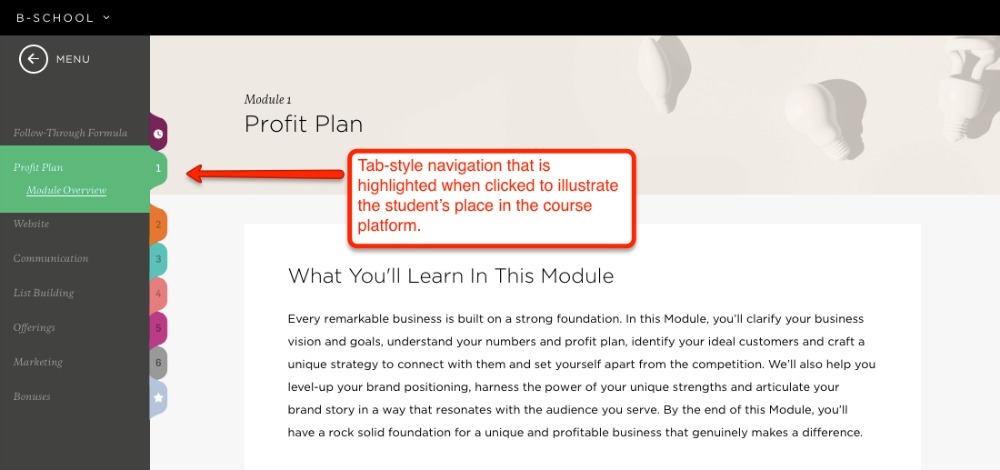
When a student clicks on a tab, its content shows either below it or next to it. Marie Forleo has a tab-style navigation in her online course B-School. The content shows up next to each tab when you click on it:
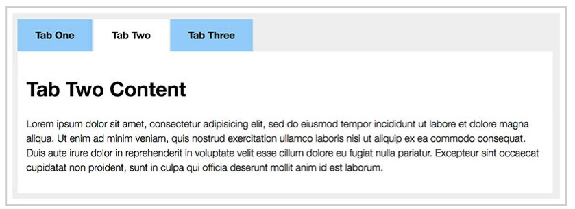
Below is an example of tab-style navigation where the content shows up beneath the tabs when clicked:
The advantage of using tabs in your online course is they resemble physical notebooks. They make the content in your course look clean and organized.
If you want to make this navigation as effective as possible, make sure students can distinguish where they’re at in your course when they’ve clicked one of your tabs. This can be done by changing the color of the tab when a student clicks it.
You can see this in action in the screenshot above for B-School — when the tab is selected, it’s a different color (green) than the rest of the items in the menu bar.
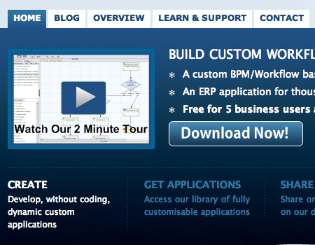
Another option is to change the background color of the entire container to match the tab color when the tab is clicked. Check out an example of this below — the tab and the background color are both blue:
This lets students know exactly where they’re at.
The clearer you can make students' status in your course, the better.
Horizontal Bar Navigation in Your Online Course
Horizontal bar navigation is a horizontal menu bar going across the top of the screen. It can have drop-down menus with additional items, like lessons or tutorials. It lets students access all areas of your course from one place, and can be seen from all pages inside of your course.
Horizontal navigation is a mainstay in web design, and it’s something most people are familiar with. It’s best for courses that don’t need a lot of information in their menu because space is limited.
Here’s an example of how Amy Porterfield uses horizontal navigation in her now-retired Webinars That Convert course (in Kajabi):
She uses it as the overall navigation of her course, but not necessarily to help students navigate from lesson to lesson. And you’ll notice in the red box above that she doesn’t have an actual navigation bar, but the menu items are horizontal in the top right section of her course.
If you do use horizontal navigation in your course, you have a few options for making it easier and more effective for your students.
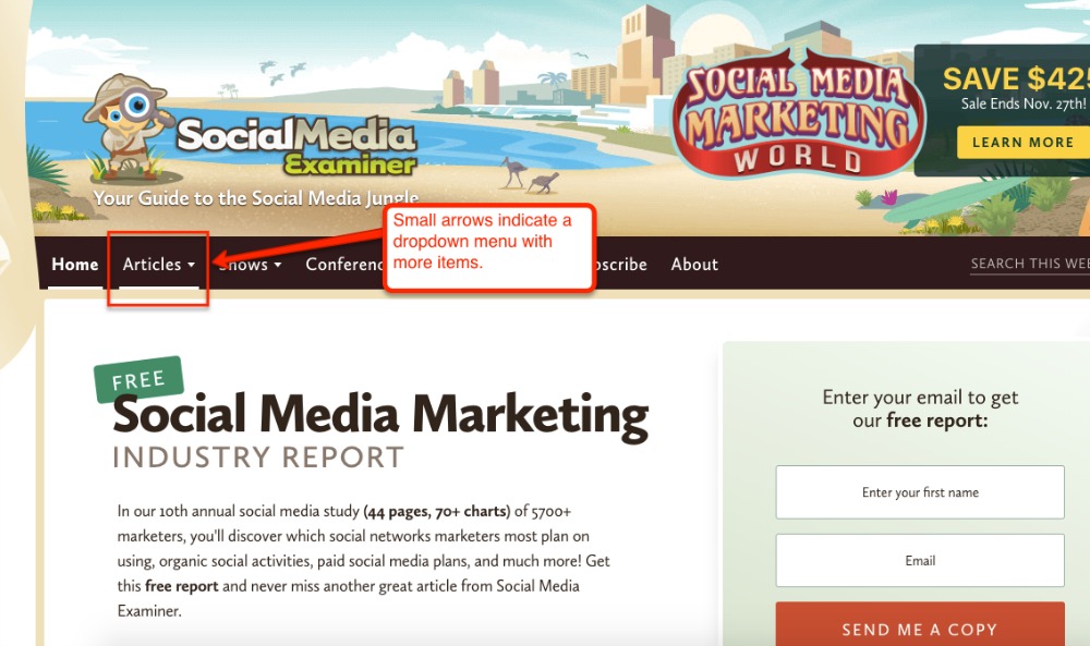
Use arrows in your navigation buttons to avoid surprise dropdowns. If you have submenus in your navigation bar items, use the arrow symbol on the button to let students know there is more info to see, like in the example below from Social Media Examiner:
Otherwise, students won’t know there’s more information to see, and they might feel like your course is lacking.
Keep search and account information buttons to the far right on your horizontal navigation bar. These are called “action links”, and just like on a regular website, students will expect to see them on the far right in your online course design.
In Amy’s Kajabi course screenshot above, you can see in the red box that the Search button is on the far right, and there’s a logo of my picture on the far right to access account information.
You don’t want to get too creative with these elements in your navigation. Give students the usability they already know and love when navigating your course with this type of menu bar.
Vertical Sidebar Navigation in Your Online Course
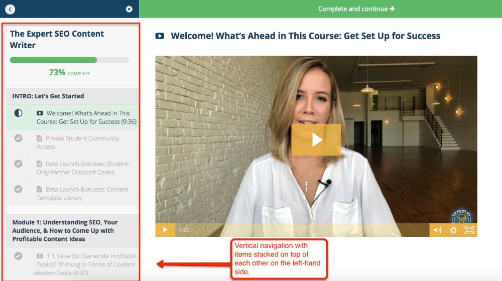
Vertical navigation is when the course navigation is formatted with items on top of each other, usually on the left-hand side. (Food for thought: Navigation is said to be faster for users when it’s placed on the left.)
This is a really common navigation style. You’ve seen it in platforms like Teachable and Thinkific.
This navigation type is great because you can add as many menu items as you want, but too many can definitely add to learner overwhelm. Limit these items only to what’s necessary.
With this navigation type, structure the information chronologically and consistently.
If every module contains a resource, make sure the position of that resource in each module is always consistent (for example, if it’s always listed last in the module, make that consistent across all modules).
And in the title of each item in your vertical navigation, make sure each module and lesson is listed chronologically in numerical order. For example, under a module titled Module 1, make sure each lesson below it is labeled Lesson 1.1, Lesson 1.2, etc. so students understand the flow of your lessons.
Breadcrumb Navigation in Your Online Course
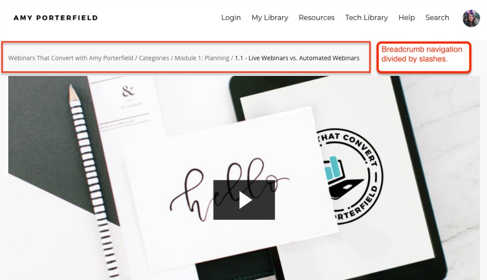
Breadcrumb navigation helps your students find their way home — like in Hansel and Gretel. It shows them where they are in your course and how to get back to sections they just came from.
Here’s another example from Amy Porterfield’s Webinars That Convert course:
This navigation is perfect for letting students quickly switch from specific lessons back to the course homepage, which they do a lot.
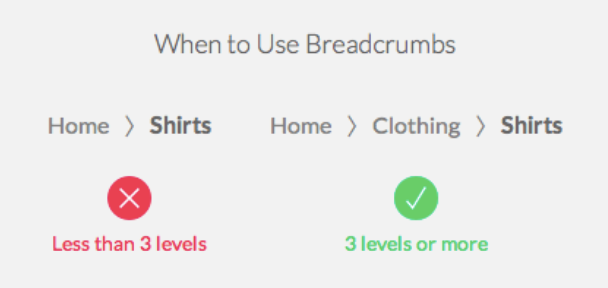
You’ll want to use breadcrumb navigation when the hierarchy of your items are 3 levels or more. Here’s an example from UX Movement:
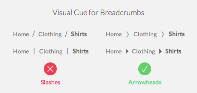
To make this kind of navigation better, use arrowheads between your items instead of slashes.
In Amy’s breadcrumb navigation above, she uses slashes, but this isn’t the best way to separate your items.
Slashes function as content separators. They aren’t as effective at separating items as arrowheads. Check out the example below.
Via UX Movement
Breadcrumb navigation makes it really easy for students to know where they’re at in your course. It’s particularly useful in online courses, because it rescues students who navigate down the rabbit hole, so to speak, when exploring your course.
Research at the Nielsen Norman Group shows there are no downsides to using breadcrumb navigation, so I’d definitely recommend incorporating it where you can.
Make it Easy for Students to Get Started
When a student first enters your course, they’re going to have an instant, visceral reaction when they first log in that says, “Where is everything and how can I access it?”
This first impression will impact whether they want to continue with the course. They’ll take in everything from usability to aesthetics.
Make it super simple for them to get started. They should know exactly where to go and what to do first.
Never assume they’ll find the beginning of your course — direct them every step of the way. Here are few ways you can do it.
Include “Welcome” or “Start Here” Text
Welcome your students to your course by titling the opening module something like “Welcome Module” or “Start Here”.
Give them an instant way to get started.
Amy Porterfield has a great opening module. The very first page includes a Welcome video and a big button you can’t miss that says “Start Course”:
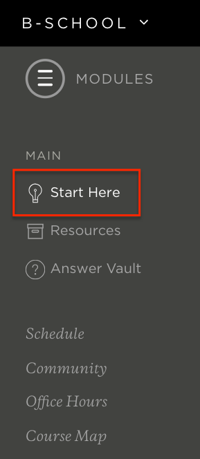
Similarly, Marie Forleo directs her students where to start with an easy-to-find “Start Here” button.
Any way you do it, make it easy for students to know exactly where and how to get started. It’s a great way to prime your audience for the level of care and encouragement you plan to give them in your course.
Offering an easy way to get started shows that you’re holding the candle for them, so to speak, as you guide them out of the “darkness” and into the “light” of transformation you’re promising.
It shows that you’re passionate about getting them to the “Start” so you can get them to the finish line.
Add a Course Tour
In the Welcome area of your course, consider adding a course tour video to drive home how students can get started and find everything they need.
This isn’t the same as a Welcome video, which usually covers your background and what students can expect to learn.
A course tour video gives your students a screenshot video breakdown of exactly where to find specific course components.
Take, for example, this course tour video below from the CPA Center of Excellence:
Course tour videos can last anywhere from ten minutes or longer, depending on how much information your course covers.
Add a Course Map
Developing a course map lets students see your entire course at-a-glance. This is great when your course packs in a lot of information — it lets students easily see the big picture of what they’re learning.
Your course map should be in your navigation or side bar so students can access it from every page. It should list out every module and lesson in your course, and link to each individual section.
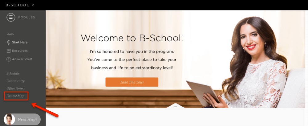
Marie Forleo’s B-School course is the only course I’ve seen with a course map:
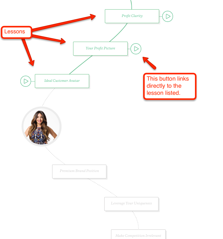
Here’s a glimpse of what it looks like in action:
This one is a bit more interactive than the average course map. As you scroll down, each lesson turns into that lesson's color, which is awesome, but don’t think yours has to be this fancy.
A simple section with each module or lesson link outlined in order is simple enough for students to get a quick glimpse of everything in your course.
Let Students See Their Progress and Status
Completing an online course is a journey that requires constant encouragement and motivation.
Your first module is like your students’ starting point on a map to Transformation Town. They’re like a big red dot on Google Maps, and you’re the turn-by-turn voice navigation.
You give them their first step — their first lesson.
They complete that step. And just like in Google Maps, after you take that first step (or turn), you ask: Okay, now where do I go? How much longer until I get there?
This is where turn-by-turn car navigation becomes “Next” and “Back” navigation in your course. There need to be indicators guiding your students at every turn as they travel through your course.
And you can think of “1.4 miles until your next turn” as labels in your slide decks that read “slide 1 of 14” (e.g., you have 13 more slides to go until you’re done with this lesson). That way students never have to guess how much longer they have for any lesson or module.
They should always see where they are on the “map” in relation to where they’re heading.
Let’s dig into a few ways you can add these elements to your course.
“Next” and “Back” Navigation Buttons
Buttons like “Next” and “Back” shouldn’t be complicated in your course. They should be what most people are familiar with, like arrows or simple “Previous” and “Next” text buttons.
While the text on these should be simple, these buttons should stand out from all other text because they need to be seen clearly. Students need to intuitively know to click the “Next” or arrow button to move forward.
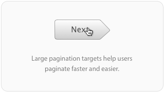
That being said, try to make your “Next” buttons not only a different color, but bigger, so that they're easy for the student to click. Don’t just use “Next” text, use an actual button, like in the example below.
Via UX Movement
Everything in your online course navigation should be easy, logical, and fast.
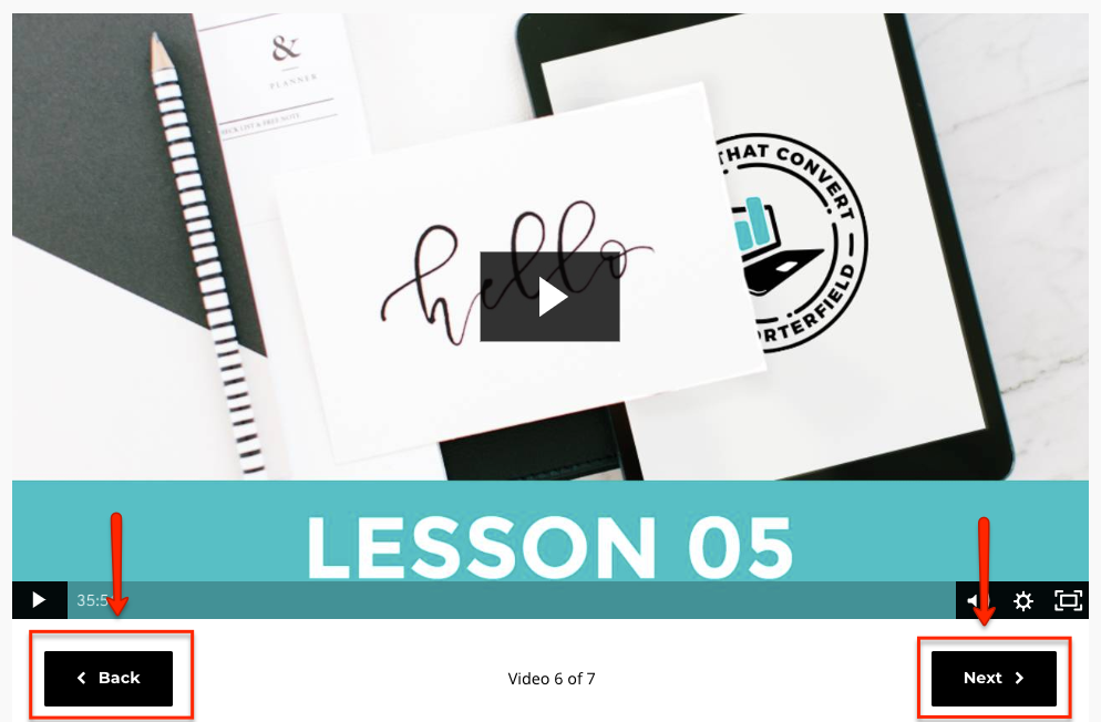
Here’s an example of “Next” and “Back” buttons in Amy Porterfield’s course:
The slide navigation above in Kajabi is great, but I think Amy should have used brighter colors for her buttons, because you want them to stand out.
You may also want to consider giving depth to your buttons, so they’re instinctively easier to press and engage with.
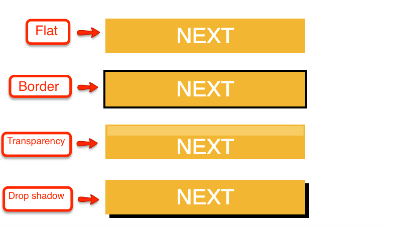
If you have the ability to customize your “Next” and “Back” buttons, try adding a drop shadow or a border. It helps them look less like basic shapes with text and more like real buttons.
Here are some examples of how to add more depth to your “Next” or “Back” buttons:
This type of navigation helps students move forward faster and easier. Make sure that in every place where your student is finishing something, they know exactly what to do next.
Progress Bars
Students need to know where they’re at in your course in relation to their big finish line at all times.
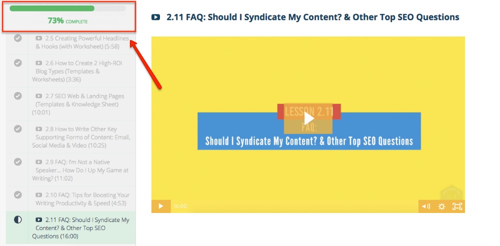
The best way to do this is to include a progress bar in your online course, either an actual bar, or text indicating a student’s progress.
An example of a traditional progress bar is in Teachable’s sidebar navigation in the example below:
They also use a percentage, so students can easily calculate how far they have left to “travel” before completing the course.
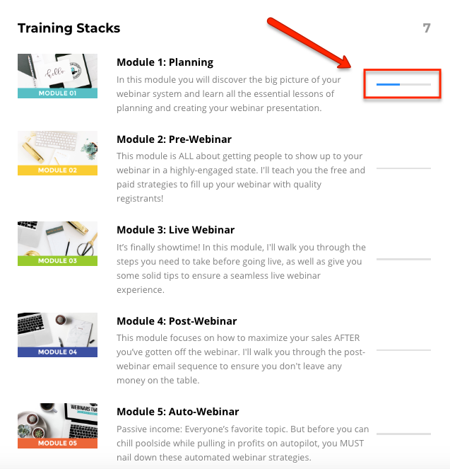
Kajabi includes a similar progress bar in their lessons:
Instead of one giant progress bar though, they use mini progress bars for each lesson. But the blank progress bars in other lessons are good indicators of how far students have left to go in the course as a whole.
In terms of progress bar colors, gray or green are considered better for helping students move through a course more smoothly.
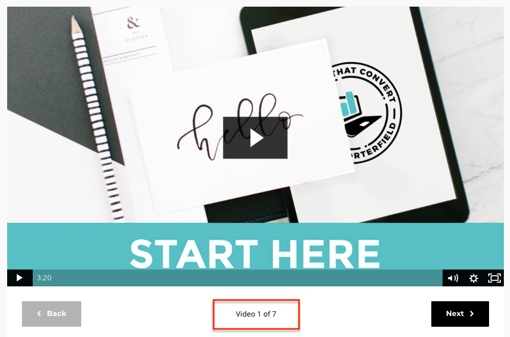
You can also use text to indicate progress in areas of your course where students have to click through a bunch of slides or videos to reach the end.
For example, “video 1 of 7” below:
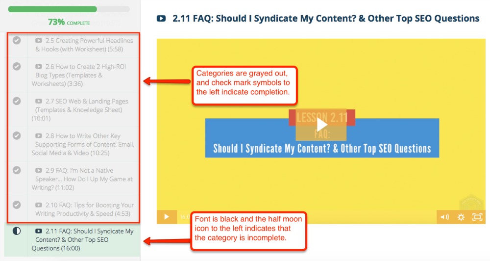
Progress bars also let students pick up where they left off if they leave the course. You don't want them wasting time revisiting lessons or videos to get back to where they were.
In that same vein, be sure to gray out or notate areas of your course that students have already completed. That way they’re able to dive right back in after they log out. Here’s a Teachable example below:
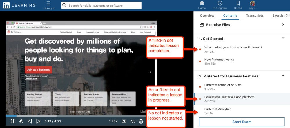
And here’s another example from LinkedIn Learning. They use dots and circles to indicate lesson or module completion:
Set Your Students Up for Success by Being Consistent
Be consistent with the layout and design of each section in your course.
If resources are always located at the end of a module, or on the right-hand side of the screen, keep that consistent.
If you include an MP3, a transcript, and a PDF for every lesson, keep that consistent across all lessons.
It's just easier for students to find what they need from wherever they’re at in your course.
Again, it’s all about predictability.
If students can predict where everything in your course is consistently located across all different lessons and modules, they’re getting what they need faster, and more intuitively, which reduces any friction they have towards completing the course.
Make Your Lesson and Module Titles Self-Descriptive
Another great way to make your online course navigation better is to make all of your lesson and module titles self-descriptive.
This means students can predict what your lessons or modules are about by their titles, moving through the exploration period of your course faster.
For example, a lesson titled “How to Design & Deliver Your Newsletter” is perfectly descriptive — students know instantly what they’re going to learn in that lesson just from quickly reading the title.
Predictability is huge in online course navigation. If students can predict what they are about to learn, they save time.
Don’t make them work to find the simplest parts of your course. Help them get to Transformation Town as quickly as possible.
Summary
A big mistake course creators make is assuming their course will be self-explanatory for students.
But quite the contrary — students need to be guided every step of the way to complete your course. Don’t expect them to put up with clunky interfaces or inconsistent course design.
Here’s a brief summary of how you can improve your online course navigation for your students:
- Online course navigation refers to the elements in your course that get students where they need to go.
- Your number one goal in improving your course navigation is to make sure it’s consistent, logical, and efficient.
- Always look at your course navigation from the learner’s perspective, rather than a developer’s perspective.
- Choose the right type of navigation for your course: tabbed, horizontal, vertical, or breadcrumb.
- Always make it super easy for students to get started with “Welcome” or “Start Here” text.
- Add a course map or course tour video to go the extra mile for students who may need extra guidance.
- Include a progress bar either in gray or green, so students can easily see where they’re at in your course.
- Keep “Next” and “Back” buttons simple, but make sure they stand out so students know how to progress in your course.
- Good course navigation is all about predictability — make sure students can predict what will be in each lesson with good lesson titles, and make sure your course layout is consistent so they can predict where to find what they need.
Are you already implementing some of these tips? Or do you have any other ideas for better course navigation to share? Let me know in the comments!
