There are a few simple tweaks you can make to your website to get more subscribers.
If you’re a course creator, you’ll want to hear this. Because subscribers are key to a successful course promotion.
Without them, you’re left without a leg to stand on.
So if you’ve got a website, let’s make it work 24/7 for you to bring in subscribers like clockwork.
Here’s how to do it.
#1 Get More Subscribers with a Call to Action Above the Fold
The first things you want to tell people when they land on your website is who you are, what you do, and how you help.
People only think about themselves. When they land on your website, they’re only going to stick around if they can easily tell them what’s in it for them.
If you don’t have a strong but clear message, they’re going to walk.
A simple way to do this is to add a call to action above the fold on your website.
If you haven’t heard of “the fold” on a website, it’s really just an invisible line.
Above it, it’s everything you can see right when you land on the page. Below it is everything you can’t see unless you scroll.
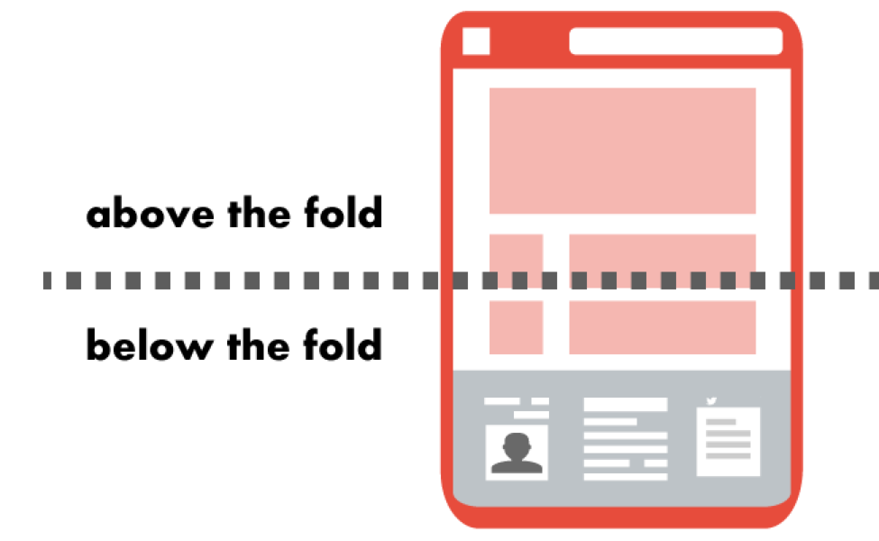
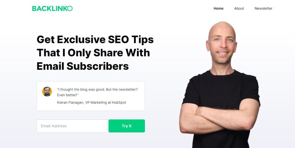
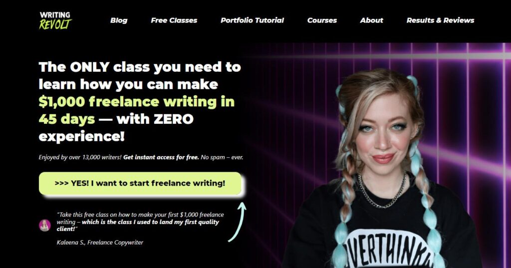
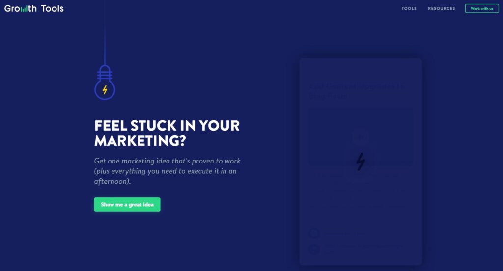
An effective way to get more subscribers from your website is to add a call to action above the fold on the homepage of your website.
Doing this requires three things:
1️⃣ An enticing headline that grabs the attention of your target audience instantly
2️⃣ A sub-headline that invites them to get something free
3️⃣ A CTA box that invites them to opt in
When you put this type of call to action above the fold on your homepage, it makes it abundantly clear what you do and how you help.
And it’s almost irresistible to your target audience.
And to show you that this format actually works, check out some of the examples below. I’m sure you’ve seen a ton of homepages set up like this, and the reason is because it works.
Example 1:
Example 2:
Example 3:
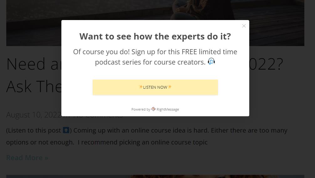
#2 Put an Exit Pop-up Window on Every Page But Your Homepage
If you think you can get more subscribers by avoiding pop-ups, you might need to start rethinking that.
Adding an exit pop-up to your website increases conversions by 2-4%.
This call to action invites people to subscribe to your email list before they leave your website.
And if you’re not a fan of pop-ups on your website, hear me out. Because an exit pop-up is much less intrusive than all the others.
Let’s say you’re at a clothing store. You walk in and immediately someone walks up to you and asks if you want to join their mailing list.
If you’re like most people, you’re not interested.
You’ve just walked into the store. You don’t know anything about it. Why would you give these strangers your email address?
But people do this online all of the time.
Sometimes they work, but they’re annoying as heck. And I only fall prey to them if I’m Christmas shopping and they’re offering me a discount.
However, if you invite people to a mailing list when they’re leaving, things change.
Let’s say you’re still in that same clothing store. You find a few cute tops, but they’re a little pricey for what you want to spend today.
You decide to leave, but the clerk stops and asks if you’d like to join the mailing list for a 15% discount on anything in the store.
You might think, yeah, that sounds great! Because you’ve already taken a look and you know there are some things that you like.
This is the way you should think when you’re inviting people to subscribe on your website.
Give them the chance to get to know you before asking them to opt into your email list.
To do this, add an exit window to every page BUT the homepage on your website.
You don’t want to add an exit window to your homepage because if they’re there, it’s almost like they’ve just walked into your store. It’s too soon.
Give them a chance to scope out the pages on your site before inviting them to subscribe.
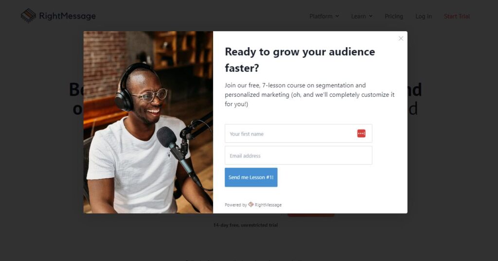
And when they get ready to leave, you can pop up and ask them if they want something cool in exchange for their email address.
If you’re worried about the tech required to put an exit window together, try a tool like RightMessage.
I use it to display exit pop-ups on my website. And it lets you easily adjust the settings so the pop-up window only fires on pages that aren’t your homepage.
This method is a great way of getting more subscribers and making your website work for you. Here are a couple of examples:
Example #1:
Example #2:
#3 Add CTAs to All of Your Blog Posts to Get More Subscribers
This goes without saying, but there should be a call to action on all of your blog posts.
Especially if your blog posts are providing educational content and value.
Let’s say you write a post about five things to know about starting a vegetable garden.
Your audience finds it and loves it because it’s exactly what they need.
So at the end of the post, you invite them to download a free checklist for starting their first vegetable garden.
This is the next step they would need to take after reading your post and it’s free! It’s a no-brainer for them to opt in to get your checklist.
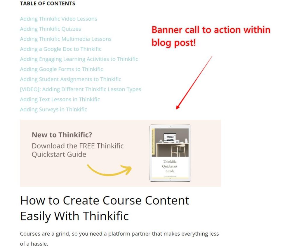
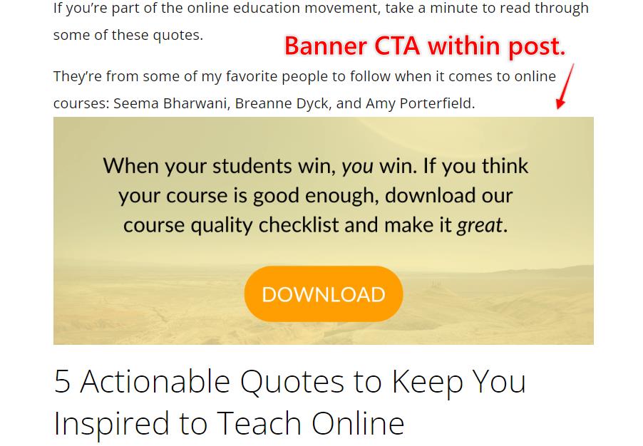
And if it’s a longer blog post, don’t hesitate to sprinkle in multiple calls to action within the same post (not just at the end).
For longer posts here on the Proof Mango blog, sometimes I put a call to action at the beginning, middle, and end of my blog posts.
You’ll definitely start to notice an uptick in subscribers the more chances your website visitors have to opt into your email list. Especially if you’re offering something valuable for free.
Here are a couple of examples of CTAs within my blog posts here on Proof Mango:
Example #1:
Example #2:
#4 Add a CTA at the Bottom of Your Homepage
The next thing you can do to optimize your website for more subscribers is to add a call to action to the bottom of your homepage.
The reason for this is that people scroll. A LOT!
When they first land on your website, they see the area above the fold and scroll down to see what you’re about.
They might not have taken you up on your initial call to action above the fold. But after they check out who you are and what you offer, they hit the bottom of your webpage.
It’s the perfect placement for another email address “ask” in exchange for something of value.
Tip #5: Add a Topic-Specific CTA to Your Top 5 Blog Posts
If you have Google Analytics set up for your website, log in and find the top five blog posts on your website.
These would be the blog posts getting the most traffic.
Inside of these blog posts, add a topic-specific call to action to each one.
For example, the vegetable garden post from earlier had a very topic-specific call to action: download a free starter checklist to plant a vegetable garden.
That was very specific to the topic we were writing about in our blog post!
Essentially, this means that we’re creating a very specific lead magnet for each of these top five blog posts.
The reason for this is because people are more likely to sign up to our email list when we offer them exactly what they want (for free).
Sometimes, if we have one lead magnet for our entire site, it’s not specific enough for every blog post. Meaning, it’s not enticing enough for someone who stops by to read a specific post of yours on a certain topic.
For example, I have a course quality checklist as the main lead magnet across my entire site. I use it on almost every blog post since it’s somewhat relevant to the online course topics on my blog.
But for the most visited blog posts on my site, I have topic-specific lead magnets.
For example, I have a blog post on How to Write a Course Outline in Google Docs. The specific call to action in that blog post is to download a course outline template.
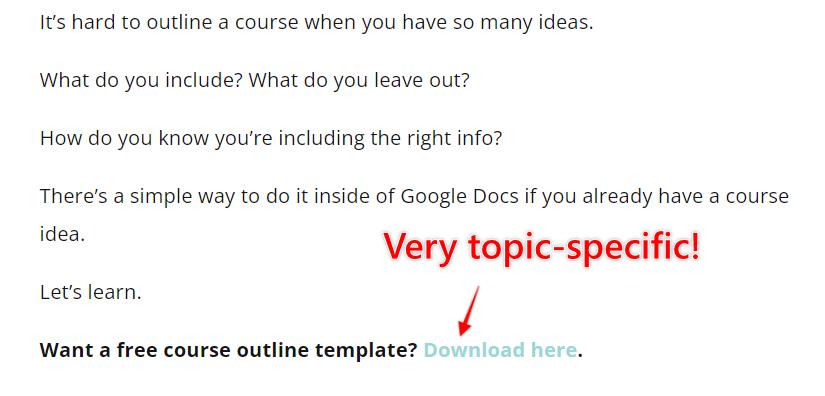 I’m not promoting the course quality checklist here, I’m promoting a free course outline template. And this freebie matches perfectly with the blog post content.
So when you do this for your top five most visited posts, it has the power to boost the number of opt-ins you get on your website significantly.
And if creating lead magnets stresses you out, you can create a quick lead magnet for free at attract.io.
Getting More Subscribers From Your Website
There’s no quick magic bullet for growing your email list. In my experience, it takes time and patience. And there are a million ways to do it.
But when you optimize your website for more conversions, you can start growing your subscribers week after week without doing too much heavy lifting.
This works great if you’re looking to launch an online course soon and you need to start growing your email list.


