Font is more than just a pretty look — it’s a vibe.
It communicates feeling and action, and as a course creator, you’re in control of both.
You can communicate imbalance, prestige, urgency, trust, power — even cheapness — in your online course with the right font.
The problem is, font is an afterthought for most course creators.
They pay little attention to visual hierarchy (we’ll get to this) or whether their font is appropriate for their audience.
The result is distraction, poor comprehension, irritability, and ultimately, an unfinished course — and all of this is totally unworthy of you.
You’re a course creator, which means you're beyond smart. You have knowledge worth sharing and you want to create impact. It doesn't make sense not to offer a clean and effective learning experience for your students.
And good font contributes to that experience.
Now let’s learn the truth about bad font in your online course, so you can make better font choices.
In this post, we'll be sharing some tips on choosing a great font for your course, as well as some font pairings to give you some inspiration.
The Truth About Bad Font in Your Online Course
Here’s the truth about bad font in your online course: it subconsciously tells your students to go away.
It’s true. You’ve spent a ton of work getting people into your course, only to unconsciously push them away once they’re in with bad font.
This is because fonts do more than just transmit information — they trigger emotion without us realizing it.
One study showed that reading words at larger font sizes could trigger an increase in emotion, more so than reading the same words at smaller sizes. Meaning if you don’t pick the right font size, it could impact the way your student reacts emotionally to your course.
(Pretty weird to think about.)
But that’s just the tip of the iceberg.
You have to take into consideration contrast, font type, line spacing, and letter spacing.
All of these communicate something on some level to your students, and when the wrong fonts are paired together, you’re in for a no-show student who drags down your completion rates.
And when those go down, there's no upside (think: less rave reviews, less testimonials, less word-of-mouth referrals, and less repeat buyers).
Here are a few things to consider when choosing the best font for your online course:
- What is it communicating to your students? In the book How the World Sees You, Sally Hogshead talks about seven languages we use to communicate to achieve different results. The main language you want to communicate in your course is trust. Make sure your typeface communicates that with steady lines, clear shape, balance, and good contrast.
- Does it make your brand look cohesive? If you have more than 2 or 3 font types, your course can look less visually appealing, less thought out, and less put together.
- Can students process the information? You need a visual hierarchy to establish the order of how students see and process your information. (We’re getting to this, I promise.) The harder your font is to read, the less you will be understood.
- Does it look good across all platforms? Different platforms display font differently, so it’s important to test it everywhere and make sure all of your fonts display clearly and consistently.
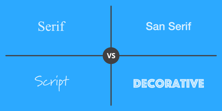
And if you’re not big on design (let’s face it, not many course creators are), here’s a graphic to help you distinguish between the four main font types:
Via Tim Slade
Serif fonts have little accent marks on them. Think Times New Roman, Garamond, and Georgia.
Sans serif fonts have no accent marks. Think Arial, Helvetica, and Verdana.
Script fonts are fonts like Great Vibes, Pacifico, and Allura. I wouldn’t recommend using these fonts in your online course because they’re not as readable. But they’re great for marketing and branding material.
Decorative fonts are the same as script fonts in your online course — use them sparingly, if at all. I’m sure they’re used to add flair in some online courses, but never use them for body content. I think that goes without saying.
One thing to keep in mind about serif fonts, if you choose to use them, is that they can slow down reading.
But this might not be a bad thing.
Multiple studies have shown that when the font takes longer to process by the reader, the reader is able to retain more information.
It sounds completely backwards, but researchers say that font difficulty builds up a kind of mental muscle while reading.
This, apparently, can lead to your students' ability to retain more of what you're reading.
However, this doesn't mean you start using hard-to-read font in your course — it just means that a serif font is something to consider.
So try to keep this in mind when choosing your font.
Let’s check out some ideal font pairings to use in your course.
Avoid Bad Font in Your Course with Good Font Pairings
Before we dive into some cool font pairings, let’s talk about visual hierarchy (finally!).
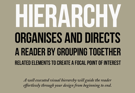
Visual hierarchy is the official font size/style/color you decide to use in the heading, subheading, and body copy of your course.
You don’t necessarily need font for all three sections, though — you could decide on just two fonts, one for your headings and one for your body copy. A good rule of thumb is to never use more than 2-3 fonts in your course to prevent things looking too disorganized.
Plus, you run into lots of opportunity for inconsistency when you have too many font types, which is never good.
When creating your visual hierarchy, keep in mind two things: the age of your audience and the subject matter of your content.
Your audience’s age is important because the older you get, the harder it is to read things online. For people at age 40 for example, only half the light makes it through their eyes. And for people at 60, only about 20% of the light floods through.
In these cases, your font size needs to be bigger than what you would normally think (if your audience is over 40).
Also, keep in mind your subject matter. What emotions are you trying to evoke with your content? Are you trying to give off an air of professionalism or fun?
It’s okay to get creative as long as people don’t have to strain to read your content.
Now let’s check out some cool font pairings for your online course.
5 Good Font Pairings for Your Online Course
According to Hoot Design Co, certain fonts can communicate trust when they use harmonious proportions, steady shapes, and stable balance.
If encouraging trust is a factor for you (let’s hope it is), keep this in mind when choosing your online course font. Here are a few we think work well together.
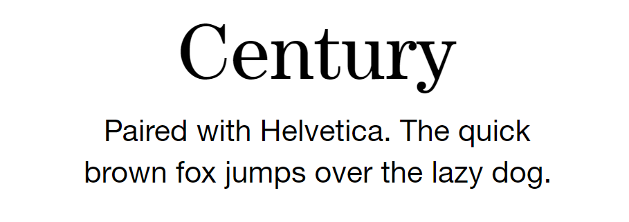
Font Pairing #1
The above fonts are a combination of serif (Century) and sans serif (Helvetica). Pairing your fonts this way, with one font from each serif type, is good practice.
Don’t try to use two serif fonts or two sans serif fonts — like Arial + Helvetica, or Times New Roman + Garamond. It just looks awkward since both font types look so similar.
This is a nice pairing for a course because it gives it that old, classy feel, while still being readable and professional. Century is a classic font from the 1890s, introduced in an American magazine of the same name for its readability at smaller font sizes.
And Helvetica is well-known for its ease of readability and ability to communicate text clearly — perfect in an online course.
Font Pairing #2
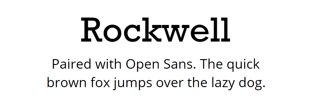
Rockwell is a bold, serif font. It projects solidity and confidence. It’s similar to old movie poster fonts, and has a lot of variety in terms of weight and italics.
I could see it used in creative courses like art, writing, or woodworking, and I think it pairs nicely with Open Sans, a commonly used font with a neutral, friendly appearance.
Font Pairing #3
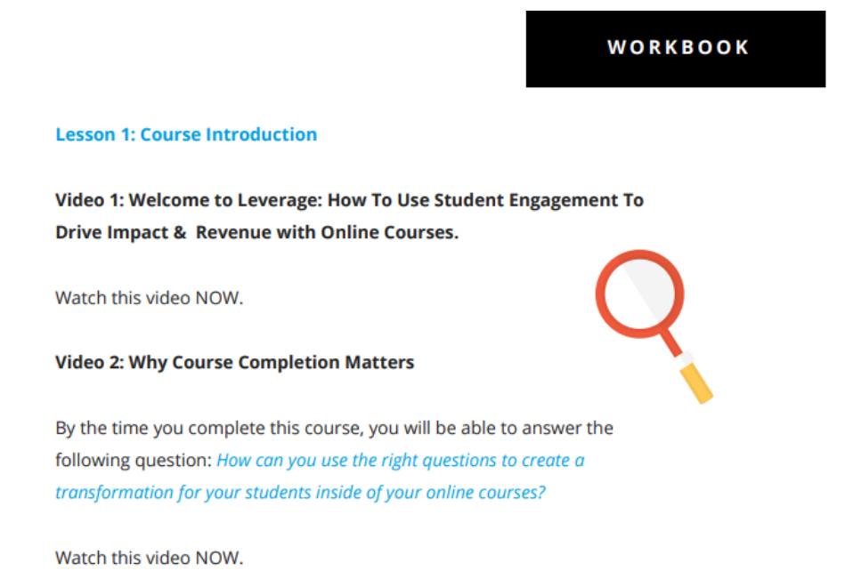
This was a font pairing I recently saw in Dr. Carrie Rose’s course Leverage. It gave the course a clean, organized, and polished feel.
It’s the same sans serif font (Open Sans), but bolded for headings. This is a good way to use one font two ways, and it’s great for keeping a consistent look and feel in your course.
Font Pairing #4
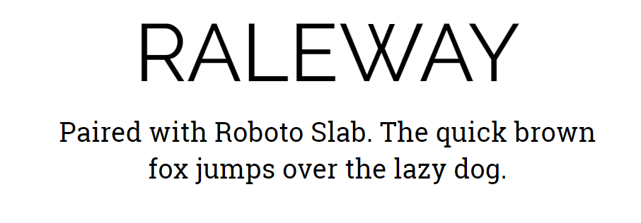 Raleway paired with Roboto Slab is a nice, clean pairing. Raleway is a more sophisticated font, while Roboto Slab is a simple serif with a natural reading rhythm.
You could also interchange the two, since Raleway is a really nice body text font used in a ton of websites.
Font Pairing #5
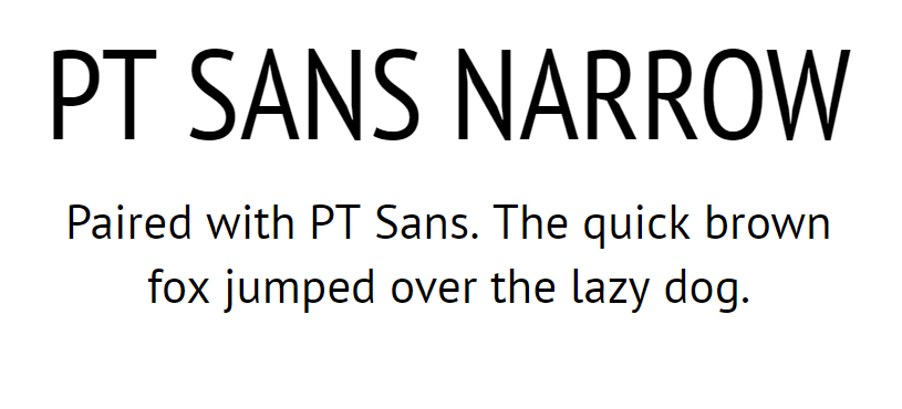 This is a font pairing of two sans serif fonts from the same family. PT Sans is most commonly used in technology or software courses, but it’s certainly not limited to those topics.
PT Sans Narrow is best used for titles because it doesn’t have the easy readability that PT Sans does when used in body text. The benefit of using the same font family is that they’re designed to work together, so you don’t have to worry about using the wrong pairing.
Final Tips on Avoiding Bad Font in Your Online Course
Font is always sending a message in your course. With good font, that message is:
Here’s where you can find the information you’re looking for quickly and easily, follow me.
With bad font, that message is:
Here’s where you can step into a maze that will lead you down some crazy turns before you find your way through. Also, it’s freezing and snowing in there so be careful.
To give you a final example of nice, polished font style in an online course, check out this screenshot from Dr. Carrie Rose’s course Leverage, which we mentioned earlier:
This is a snippet from her workbook, but the background color is white and the font color is black, which makes the content highly readable. I also like the way she mixes in light blue. It's easy on the eyes, and it helps you easily differentiate parts of the course content.
She’s using a sans serif font, which is a popular font type in online courses because it's more readable. And readability is essential for comprehension.
As a course creator, your course content should be not only engaging, but highly readable.
However, like we mentioned earlier, sometimes a serif font (like Times New Roman or Garamond) can make your readers slow down and spend more time with your content.
So if that's your goal, take that into account.
Choosing the right font for both your content and audience lets your students know you care about their learning — and they’ll subconsciously feel the impact your font has on them.
A great tip from Dr. Kevin Larson, a reading psychologist interviewed on the Human Tech podcast, is to be invisible with your font selection:
“There’s a long standing tradition in typography where the goal is to be invisible. Provide what the reader needs and get out of the way so they can focus on the content.”
Conversely, let’s look at an example of not-so-great font in your online course. Here’s an example of white Impact font on a black background on a slide deck:
This would be considered hard to read.
Not only because of the type of font, but the white text on the black background strains readers’ eyes because it stimulates all color-sensitive visual receptors in the eye in equal amounts.
The last thing you want your students to feel is strain. They should be comfortably absorbing your course in every section.
So when choosing your online course font, first think about the audience you’re serving, and what makes sense for them.
Next, figure out the right font pairing. Choose one that’s going to make you invisible, and make the content the focus.
Keep these final few things in mind:
- Create a visual hierarchy. When you decide what font you’ll use in titles and body text, it adds consistency that helps your students find the content they want faster.
- Small font induces eye fatigue. Keep your body font size between 14-16 pt and never below 10 pt.
- Never use more than 3 fonts in your online course.
- Never mix two of the same font types, for example, Century and Times New Roman.
- Use white space for visual separation of your titles, subtitles, content, and/or artwork.
- Don’t overdo it with the caps, bolded text, italics, or underlines. Especially avoid underlining words, as those are always seen as links online and could confuse students.
What font do you use in your online course? How much thought did you put into it? Do you think it makes a difference? I'd love to hear your stories!

